


Orbitus
Brand Identity
Empowering professionals to navigate successful careers, Orbitus offers a one-stop shop for self-discovery, skill development, and exciting job connections.
Seeing the need for a brand that mirrored their platform's energy, the team behind Orbitus partnered with Zeal Studio. The goal was to craft a fresh and inspiring brand identity that reflected the bright futures Orbitus helps build.
Through in-depth discussions and user research, we collaborated closely with the Orbitus team to understand their vision, target audience, and the platform's unique value proposition. This deep dive allowed us to craft a brand identity that resonated perfectly with both the platform's functionality and its aspirational message.

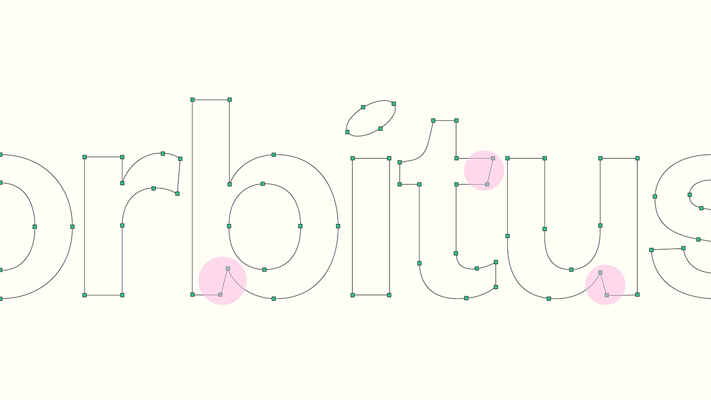
The Logo
We designed a dynamic logo for Orbitus that embodied the platform's spirit of constant growth and progress. The brandmark utilizes a series of circles that visually represent the continuous cycle of career development.
For the logotype, we used a contemporary grotesque typeface, but with subtle modifications to the letters to create a unique look. We also modified the letter 'i" where a narrow circle replaces the traditional dot, adding a touch of playfulness and reinforcing the circular motif present in the brandmark.
For the logotype, we used a contemporary grotesque typeface, but with subtle modifications to the letters to create a unique look. We also modified the letter 'i" where a narrow circle replaces the traditional dot, adding a touch of playfulness and reinforcing the circular motif present in the brandmark.


Color Palette
& Typography
We curated a modern color palette created a sense of trust, growth, possibility, and sophistication.
This combination reflects the platform's goal of guiding users in their careers with a balance of seriousness and encouragement.
The primary typeface, Founders Grotesk, is likely a clean, sans-serif font, conveying stability and efficiency. The secondary typeface, Circular, is another sans-serif option, but with a geometric aesthetic that complements Founders Grotesk. This combination creates the Orbitus brand that feels both professional and approachable.


Visual System
We incorporated a collection of modern gradient splines across all applications. These smooth color transitions mirror the platform's energetic and progressive approach to career development, creating a modern feel that resonates with users seeking a contemporary path forward.


Thank you for viewing!
Client: Orbitus
Scope: Brand Strategy, Brand Identity, Web Design
Year: 2024
Design Director: Mubeen Qassim
Agency: Zeal Studio
Share your thoughts in the comments. All feedback is highly appreciated!
Work with us:
Send an inquiry here or email us at hello@zealstudio.me
Visit our Website | Follow us on Instagram


